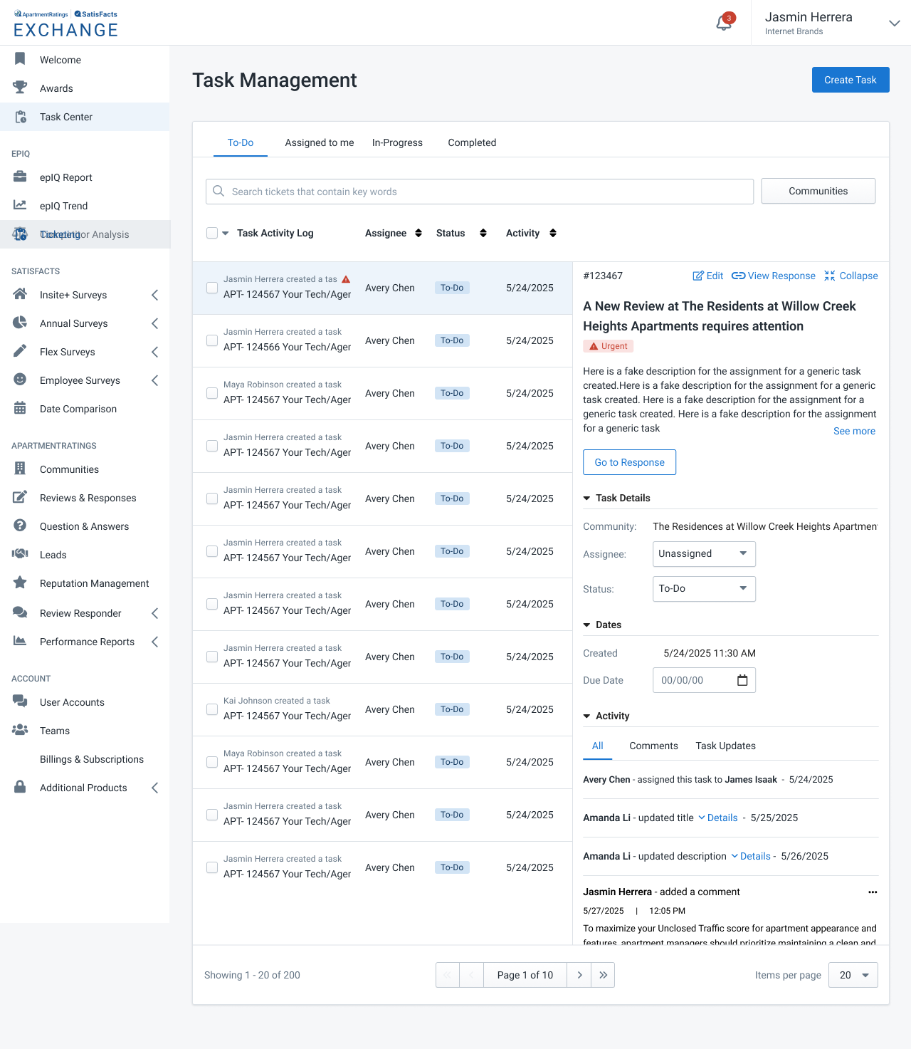
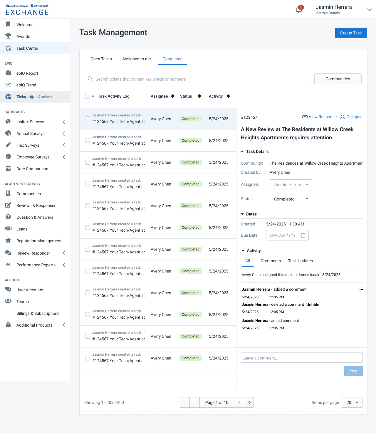
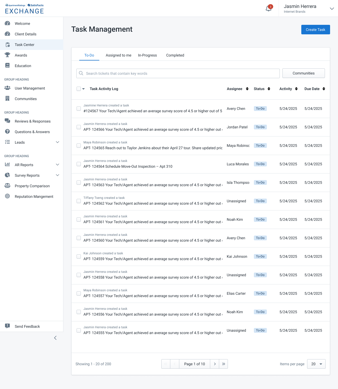
Designing a scalable task system to bring clarity, ownership, and efficiency to cross-team workflows.
Lead UX Designer Discovery, Information Architecture, User Flows, Wireframes, Prototyping, Final UI

The Exchange Platform is used by multiple internal teams to manage high volume operational workflows such as orders, payments, and customer requests. Despite this complexity, there was no native way for users to track their tasks, owners, or deadlines. This led to missed follow-ups, unclear ownership, and constant context switching.
I designed Task Center as a net new feature that centralizes task creation, assignment, and tracking into one place. It gives every user a clear view of what they need to work on today and creates a scalable foundation for future automation and reporting.
Lead UX
Product Manager, Engineering Lead, Operations Stakeholders
8 weeks (Discovery → Approved Phase 1 designs)
"If I don't write a task down the minute I hear it, it's gone. There's nowhere in the product that shows me what I owe."
Only show information needed to decide what to work on next.
Creating and updating tasks should feel effortless, or users will avoid the system.
Task states, priorities, and due dates should be instantly recognizable at a glance.
Consistent actions and structure reduce confusion, especially during cross-team handoffs.
I designed the Task Center flows to minimize friction and help users understand what they owe, complete their work quickly, and keep ownership clear. The information architecture introduces a new structured space in the Exchange Platform that unifies task-related views for the first time.
Task Created → My Tasks → Task Detail → Completed
I explored low-fidelity concepts to understand user preferences for viewing, navigating, and acting on tasks. These wireframes validated core layout, task hierarchy, and interaction patterns for fast scanning, strong ownership clarity, and low context switching.

Exploration of a lightweight list view focusing on scannability and prioritization.

Exploration of combining list + detail to reduce context switching.
After validating task flows and interaction patterns through wireframes, I moved into high-fidelity designs. These mocks reflect the first functional release of Task Center Version 1. The UI emphasizes clarity, predictable patterns, and reducing context switching – enabling operations teams to triage and complete tasks faster.

To-Do List (Condensed) - Optimized for fast scanning of large task volumes. Users see only the essentials: task title, assignee, activity, and due date. This view supports high-speed triage when hundreds of tasks come in daily.

To-Do List (Expanded Detail Panel) - Expanding a task reveals an inline right-side detail panel. This reduces context switching by letting users read descriptions, update status, add comments, and review activity without losing their place in the list.

Completed Tasks View - Completed tasks are locked to maintain ownership history. Users can still reopen tasks by changing the status from "Completed" to "To-Do," which moves it back into the active queue.
These designs represent the foundation for future releases. Phase 2 enhancements currently in exploration include file uploads, image attachments, richer media inputs, SMS alerts, and a centralized notification center for cross-team alignment.
Users manage dozens of tasks daily, so the UI must be scannable.
Ops members told us they juggle tasks across Slack, spreadsheets, and memory.
Ownership was the #1 pain point during interviews.
Users complained that updating tasks across tools slowed them down.
Ops users told us Jira-like tools felt 'too heavy'.
Task mistakes create lost work and operational blockers.
These design decisions were shaped by user interviews, workflow observations, and technical constraints across the Exchange platform. Each principle directly addresses a real pain point uncovered in research.
Expected 30 to 40 percent reduction in time spent switching between Slack, email, and spreadsheets
Inline task details and locked statuses minimize accidental changes.
Shared visibility improves coordination and reduces duplicate work.
I see opportunities to expand the Task Center further, which would allow Ops teams to manage more processes from a single place. For example:
A way to match shipments and invoices when automated matching fails.
Select multiple tasks to quickly reassign or update statuses in one step.
Automated alerts when tasks are at risk of violating service-level agreements.
Use artificial intelligence to prioritize tasks based on patterns and past decisions.
These additional features would increase productivity and help ensure successful long-term adoption of the Task Center.
The Task Center project successfully introduced a centralized, intuitive workflow for Ops teams who previously relied on scattered tools like Slack, spreadsheets, and email. Through iterative design, user interviews, and collaboration with engineering, I created a system that reduces cognitive load, increases efficiency, and supports scalable growth for the Exchange platform.
Designing task-based systems revealed the importance of predictable interaction patterns, clear hierarchy, and minimizing unnecessary friction. I also learned how crucial it is to deeply understand an Ops user's mental model — their workflows are fast, detail-heavy, and high-stakes, so every interaction needed to feel effortless and reliable.
This project involved close alignment with PMs, engineers, and the Ops team. Their insights helped shape rules for task ownership, historical locking, status transitions, performance considerations, and technical dependencies. The resulting design dramatically improved speed, lowered error risk, and set a foundation for future automation and AI-driven enhancements.
Future phases like manual matching, bulk actions, SLA alerts, and AI-recommended tasks will further reduce operational blockers and expand what Ops can manage from a single place. These enhancements will help ensure long-term adoption and measurable business impact.