Community Page Navigation Redesign
Information architecture and navigation behavior rebuilt around how renters scan community pages—not internal taxonomy.
Reduced cognitive load by prioritizing reviews, media, and floor plans in tab order and mobile patterns while keeping every business section reachable.
UX Research · Information Architecture · Interaction Design
Overview
Community pages sit mid-funnel: renters validate trust before contact. Navigation had grown by org structure, not scan behavior—so high-intent content was hard to predict and slow to reach on mobile. I reordered the IA from analytics-ranked intent, consolidated media, and designed overflow so priority tabs stay scannable without hiding secondary sections.
Problem
Renters treated tabs like a search task: they could not predict where reviews, floor plans, or media lived. Wrapped labels and flat hierarchy raised cognitive load and broke mobile scan paths.
Renter behavior
- Scanned horizontally for cues—not explored every tab
- Abandoned when labels did not match mental models
- Needed faster paths to reviews, photos, and plans
IA constraints
- All CMS sections must remain reachable in V1
- Same priority order on mobile and desktop
- Tab overflow without losing discoverability
- Partner-facing pages still demo full inventory
Information architecture
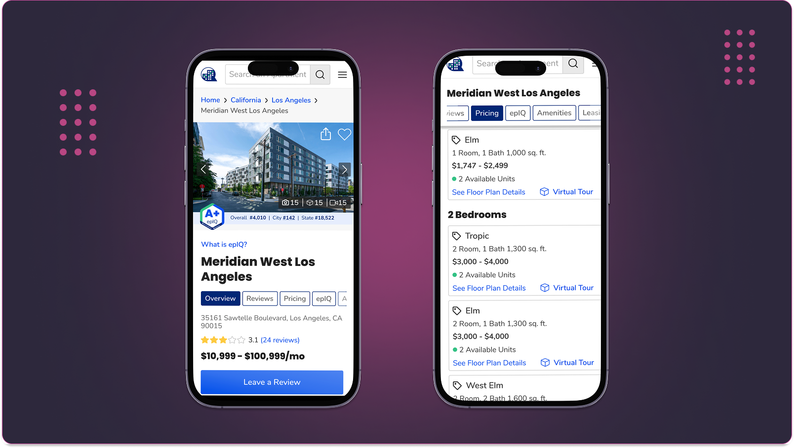
Tab order is the primary hierarchy on community pages. I mapped org-driven navigation against renter intent, then locked a before/after structure for reviews, media, floor plans, and supporting content.
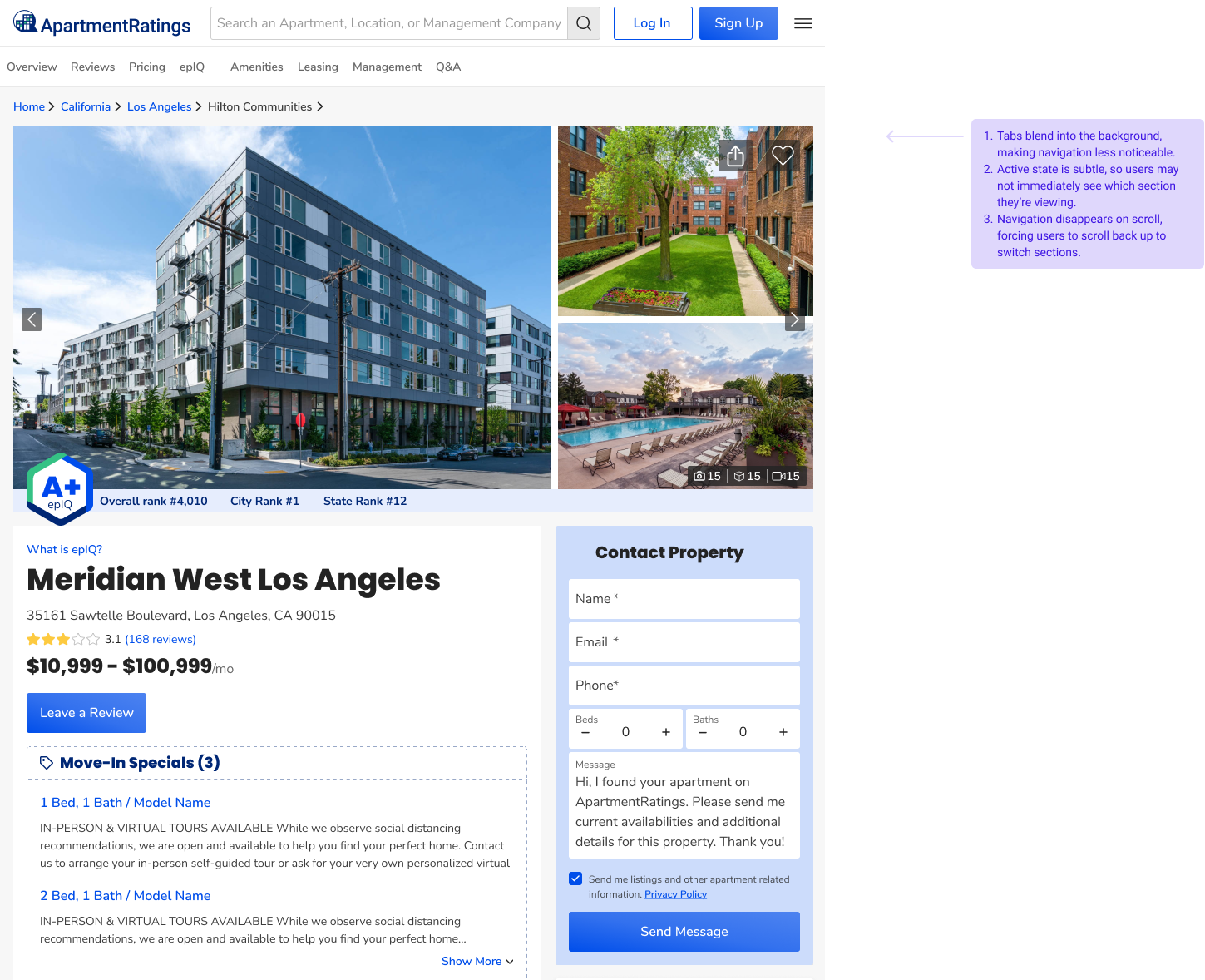
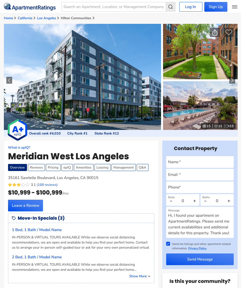
Before · org structure
- Overview
- Amenities
- Photos
- Videos
- Reviews
- Floor Plans
- Map & Area
- …more tabs
After · renter intent
- Reviews
- Photos & Videos
- Floor Plans
- Overview
- Amenities
- Map & Area
- …overflow · scroll
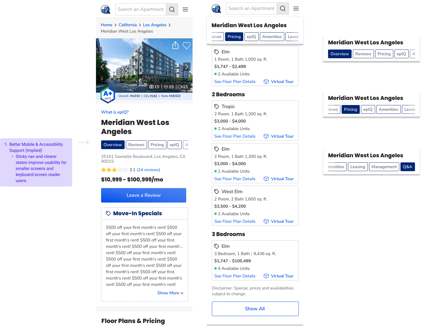
Mobile: same labels and priority order—collapsible pattern, not a shortened list. Priority tabs stay visible; overflow scrolls with clear active state.
Key Insights
From analytics on tab engagement, session replays, and moderated findability tasks—not feature requests.
- Renters scanned for trust signals first; they compared tab labels before committing to scroll depth.
- Users could not predict content locations—reviews and floor plans felt “on the page somewhere,” not in a known place.
- When tabs wrapped on mobile, hierarchy collapsed; high-interest sections competed with low-traffic labels in one flat row.
“I know reviews are on this page—I can't tell which tab takes me there.”Usability synthesis
Journey Map
Renter path from landing to next step—where skim behavior and unpredictable tabs eroded confidence before reviews, media, or floor plans.
- 01
Discover
FeelingSkeptical · fast scan
GoalWorth a deeper look?
ActionsScan hero and tab row before scrolling.
FrictionUnpredictable tabs. No clear entry to reviews or media.
Design opportunityIntent-led tab order. Reviews, media, and plans lead the row.
- 02
Evaluate
FeelingImpatient · low confidence
GoalEnough trust to stay in the set.
ActionsHunt for reviews and rating themes.
FrictionReviews buried mid-row. Bounce before the first meaningful click.
Design opportunityReviews first. Trust content in the primary scan path.
- 03
Compare
FeelingOverloaded
GoalStack up against alternatives.
ActionsJump between plans, photos, and overview.
FrictionSplit media tabs. Comparison slows when visual proof is scattered.
Design opportunityOne media destination. Stable tab order across breakpoints.
- 04
Decide
FeelingFatigued · exit-ready
GoalConfirm fit—or exit quickly.
ActionsRevisit tabs; scroll for buried details.
FrictionMobile wrap. Hierarchy collapses; low-intent labels compete.
Design opportunityOverflow as IA. Scrollable row, strong active state.
- 05
Contact / Convert
FeelingCautious · disengaged
GoalContact, save, or leave with clarity.
ActionsConvert—or bail if wayfinding cost is too high.
FrictionWayfinding tax. Friction at the bottom of the funnel.
Design opportunityShorter path to CTA. Trust content connects to the next step.
Content wasn’t missing—navigation forced hunt-and-peck before confidence could form.
Strategy
Each move targets cognitive load, content prioritization, and discoverability—mobile-first, with scanability over tab count.
Intent-led tab order
Priority sections sat mid-row; renters scrolled past them hunting by label.
Reviews → Photos & Videos → Floor Plans → supporting sections—order matches analytics-ranked intent.
Faster first click to trust and layout content; less horizontal hunting.
Consolidate media
Separate Photos and Videos tabs split attention and duplicated mental models.
Single Photos & Videos destination with shared depth.
One scan target for visual proof; fewer tabs in the primary row.
Overflow as IA, not failure
Wrapped tabs looked like equal choices and hid active section on small screens.
Horizontal scroll, strong active state, and consistent labels when the row exceeds viewport.
Secondary sections stay reachable without flattening priority tabs.
Mobile parity
Mobile users needed the same hierarchy—not a reduced or reordered subset.
Collapsible navigation with identical labels and order as desktop.
Predictable wayfinding across breakpoints; no “mobile surprise” tabs.
Solution
Before
- Tab order followed internal taxonomy
- Reviews and floor plans buried mid-row
- Photos and video split across tabs
After
- Priority content left-aligned in scan path
- Media grouped; fewer competing labels
- Overflow keeps secondary sections one gesture away
Impact
+11%
Community page visits
More renters reached community pages after navigation clarified entry to priority sections.
+15%
Priority tab engagement
Higher interaction with reviews, combined media, and floor plans vs. pre-reorder baseline.
Lower wayfinding friction
Fewer support and research reports about “finding reviews” or plans on the page.
Reusable IA pattern
Intent-led tab model carried to later community work and partner demos.
Reflection
Ranking sections from behavior and analytics before visual design kept the IA honest. The win was structural—predictable hierarchy and mobile parity—not cosmetic tab styling. Next I'd instrument time-to-first meaningful tab click and compare scan paths on wrapped vs. overflow patterns.