Desktop Reviews & topic visibility
Pipeline topics; sort unchanged; disclosure before interaction. Ops monitor recurring themes without per-review manual tagging.
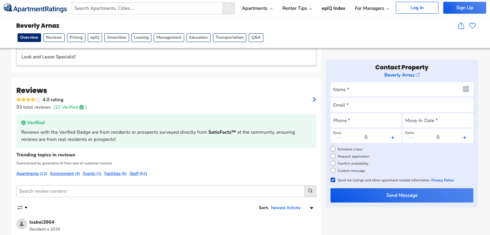
ApartmentRatings property pages held hundreds of reviews. Renters wanted to spot recurring issues fast—but newest-first feeds buried patterns and keyword search failed when wording varied. I designed semantic topic chips inside the existing Reviews tab so renters could navigate by pattern, not search for it.
A product design case study about using AI for navigation, not narration—designing for renter trust, scaled content, and cross-functional constraints.
ResultThe feature shipped as AI Trending Topics and introduced a scalable framework for surfacing AI-generated review insights while preserving user trust and existing review workflows.
Product Design · AI-powered discovery · Marketplace
On high-volume property pages, renters struggled to spot recurring issues across hundreds of reviews. I introduced semantic topic labels inside the existing Reviews tab so renters could navigate by pattern—not search for it. Resident feedback stayed the source of truth; AI handled discovery, not interpretation.
ApartmentRatings owned one of the largest renter-review corpora in the marketplace—but volume was working against the product. More reviews meant slower decisions and higher bounce on the pages with the most ad inventory.
If renters could see which themes recurred at a glance, they could judge dealbreakers in seconds—not twenty minutes of scrolling.
Solvable with classification, not generative copy.
Renters weren’t looking for more information. They were looking for a way through the information they already had.
“I don't have time to read 100 reviews—I need to know if noise or maintenance keeps coming up.”Renter feedback, usability synthesis
The shape of the solution was set as much by what we couldn’t do as by what we wanted to ship.
Research paired Reviews-tab analytics with moderated sessions on dense pages. Each finding had to point to a concrete design implication—otherwise it didn’t earn a slot in scope.
Renters scanned for patterns before reading any individual review. In moderated tasks on dense pages, they paused on the label row and used counts to decide what to open.
Topics had to live above the feed as the primary hierarchy, with counts as a first-class signal—not metadata.
Product outcomeA fixed topic row earned the visual weight that the feed used to consume.
Renters distrusted AI when it summarized other residents. In pattern audits, they skipped summary blocks and went straight to original cards.
AI could organize content—not speak for residents. No summary modules; disclosure on first paint.
Product outcomeVerified Reviews stayed the source of truth. We shipped navigation, not narration.
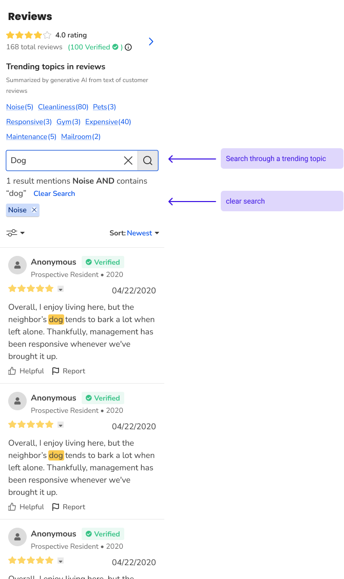
Keyword search failed when wording varied. “Thin walls” and “noise” returned different result sets; renters bounced after the first miss.
Discovery had to be topic-led. Search refines within a topic; it doesn’t start exploration.
Product outcomeSemantic labels group varied phrasing under one chip. Search dead-ends dropped in usability runs.
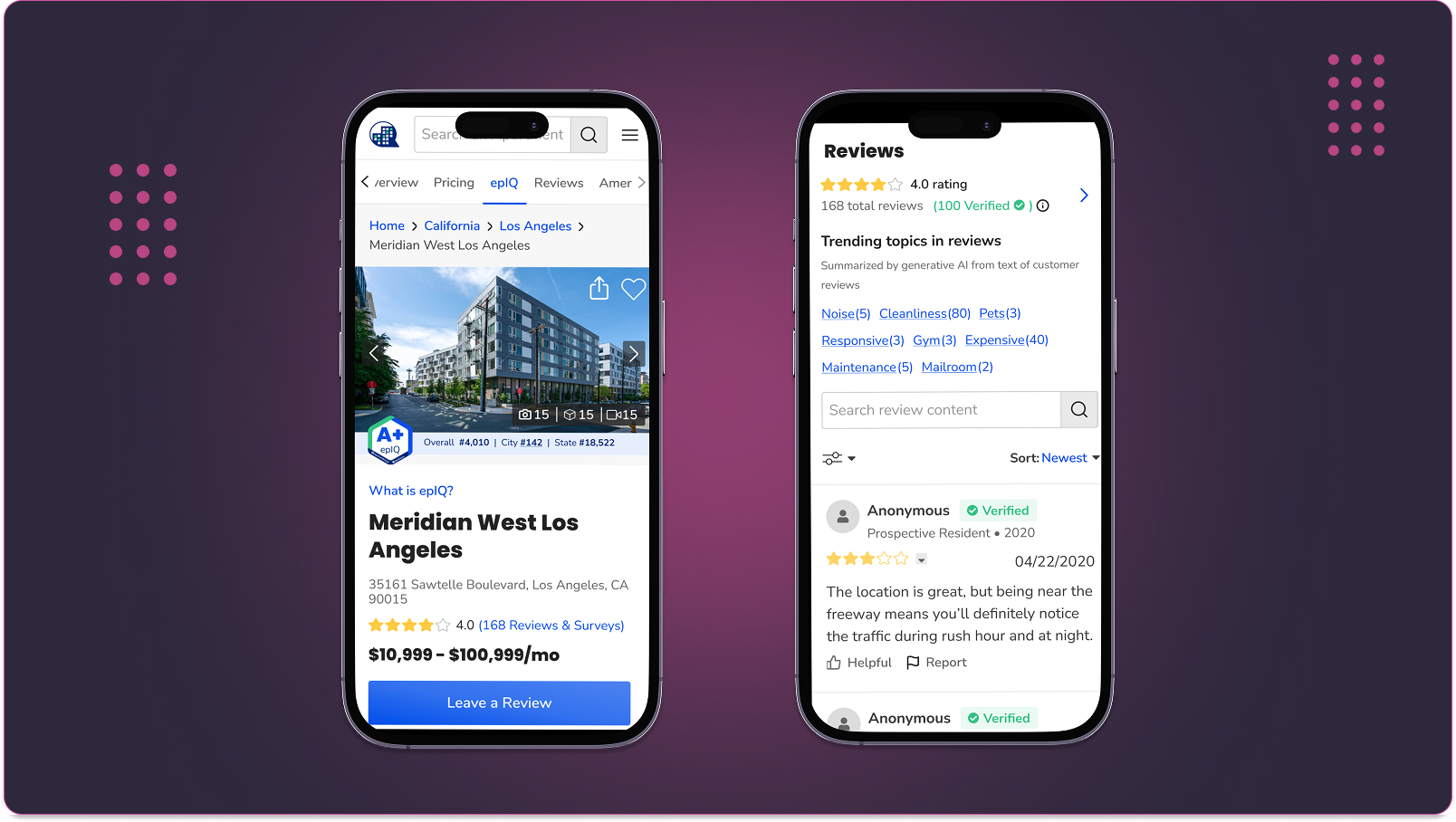
Mobile was where the decision happened. Most high-intent traffic came from mobile, and mobile users scrolled less and exited sooner on dense pages.
Mobile parity wasn’t polish—it was the launch surface. Mobile led every design round.
Product outcomeOne filter model across breakpoints. No forked mobile feature.
Before exploring solutions, I mapped the renter journey to identify where cognitive load was highest and where AI could provide meaningful assistance without taking over the renter’s judgment. The map made the opportunity precise: Discover and Evaluate were where renters disengaged—not Decide.
FeelingCurious · distracted
Is this topic worth attention?
Scan trending lists and labels.
Flat hierarchy. Every topic reads equally important.
Clear ranking. Stronger labels and visual priority.
FeelingOverwhelmed · skimming
Grasp the conversation fast.
Open thread; skim top responses.
Wall of text. Repeated takes spike cognitive load.
Scannable grouping. Tighter spacing and content structure.
FeelingSkeptical · low trust
Separate signal from noise.
Weigh engagement and contributor quality.
Low-trust mix. Hard to spot credible insights.
Credibility cues. Surface engagement and relevance.
FeelingFatigued · indecisive
Form a view without exhaustion.
Scroll for diverse perspectives.
Buried viewpoints. High-signal takes lost in repetition.
Prioritize diversity. Elevate distinct, high-signal replies.
FeelingDrained · likely to bounce
Engage—or move on with clarity.
Contribute, bookmark, or leave.
Value lag. Effort exceeds payoff before meaningful insight.
Progressive disclosure. Less load; faster path to value.
Renters had the information they needed—competing signals made relevance hard to recognize at a glance. AI could navigate, not narrate.
Five principles framed the decisions. They were the contract between design, product, and engineering—what we’d ship, what we’d refuse, and how we’d evaluate a proposed change later.
Surface the few themes that recur most. Let counts do the prioritization work.
Renters didn’t know what to look for. Topics had to be browseable entry points.
AI organizes; residents speak. Original reviews stayed the proof.
One filter at a time. A visible reset gets back to the full feed in one tap.
Chips, disclosure, and filter state designed as a reusable pattern—not a one-off.
The harder calls weren’t about visual design—they were tradeoffs between scope, trust, and renter behavior. Each decision was made with Product and Engineering at the table.
Why. Combining topics broke the mental model and parity with site search.
Tradeoff. Power users lost topic intersection.
Outcome. Predictable filter behavior that shipped on time.
Why. Renters distrusted paraphrase; Legal required Verified Reviews stay the auditable source.
Tradeoff. Less visible “AI surface area” at launch.
Outcome. A defensible launch and a trust model the team can extend later.
Why. A new tab would have signaled “AI experiment” and split ops, analytics, and content models.
Tradeoff. Less marketable; competed for vertical space in a busy tab.
Outcome. One tab, one model, mobile/desktop parity.
Why. Search-then-filter produced empty result sets and high abandonment.
Tradeoff. Renters who knew the exact phrase had to pick a topic first.
Outcome. Fewer dead ends; clearer recovery when filters over-narrowed.
V1 shipped as filter states inside the Reviews tab: labeled topics, active chips with counts, in-topic search, and a reset—plus desktop visibility for pipeline-driven topics. Hierarchy and disclosure were identical across breakpoints.
Pipeline topics; sort unchanged; disclosure before interaction. Ops monitor recurring themes without per-review manual tagging.
Active chip and count state make the current filter obvious. Renters validate labels by reading the cards—not by trusting the label text alone.
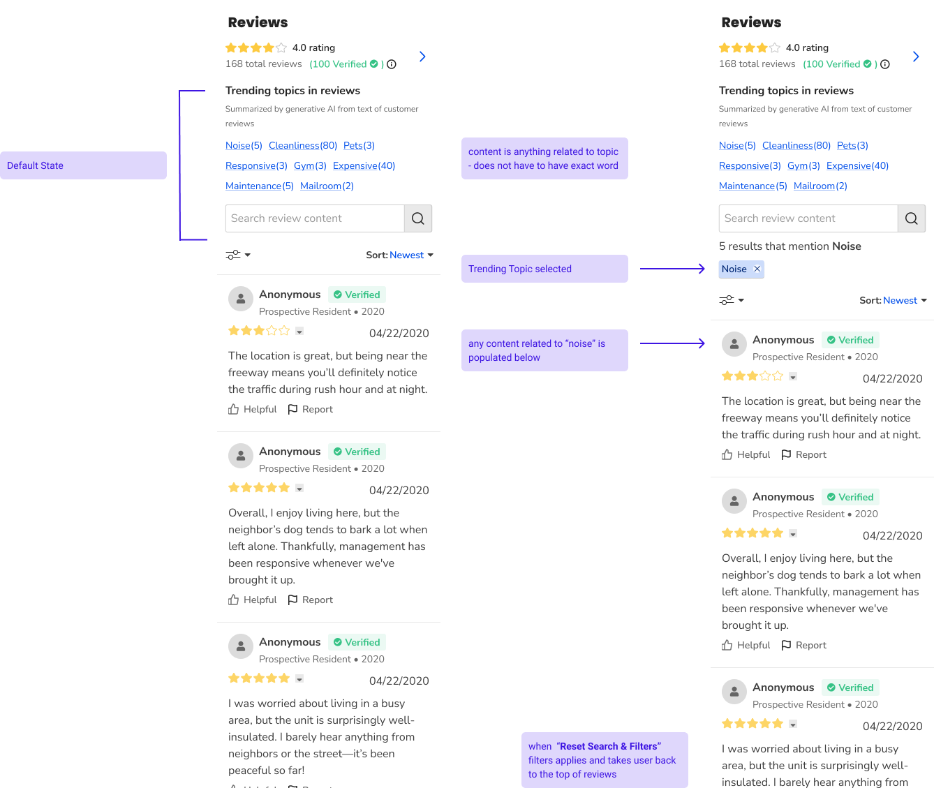
Search applies only after a topic is selected—matching how renters refine, not start, discovery.
Same hierarchy on mobile: topics → filter → cards. One filter state, one disclosure pattern, one hierarchy. No forked mobile feature.
We tracked Reviews-tab behavior and moderated follow-ups—not generic “AI engagement.” Signals below are what the team observed; anything we couldn’t measure is framed as an expected product outcome, not a claim.
In follow-up usability sessions, renters reached a themed review set in fewer interactions than unfiltered browse.
Verified Reviews placement and sort unchanged through launch QA. Disclosure visible on first paint, all breakpoints.
Pipeline-driven topics replaced manual theme tracking in partner demos and support walkthroughs.
Chips, disclosure, and topic-first filtering became a reusable framework future AI features extend.
One filter model across breakpoints. Removed a forking risk between mobile and desktop work.
Trending topic chips became a measurable interaction surface on high-volume property pages.
The most strategic AI decision wasn’t a model choice—it was the choice not to summarize. Saying no to a summary block early protected the trust the rest of the product depends on.
Working cross-functionally surfaced how much of “AI design” is actually system design. The interesting tradeoffs lived between Product, Engineering, and Legal. Getting those constraints aligned was the real interaction-design work.
I’d push earlier on mobile next time. Mobile parity was a goal from day one, but the strongest scan signals came from mobile tests—I’d open every round there and let desktop catch up.
The framing that changed everything: ship navigation, not narration. It defined what we built, what we deferred, and how the team talks about AI on the product today.